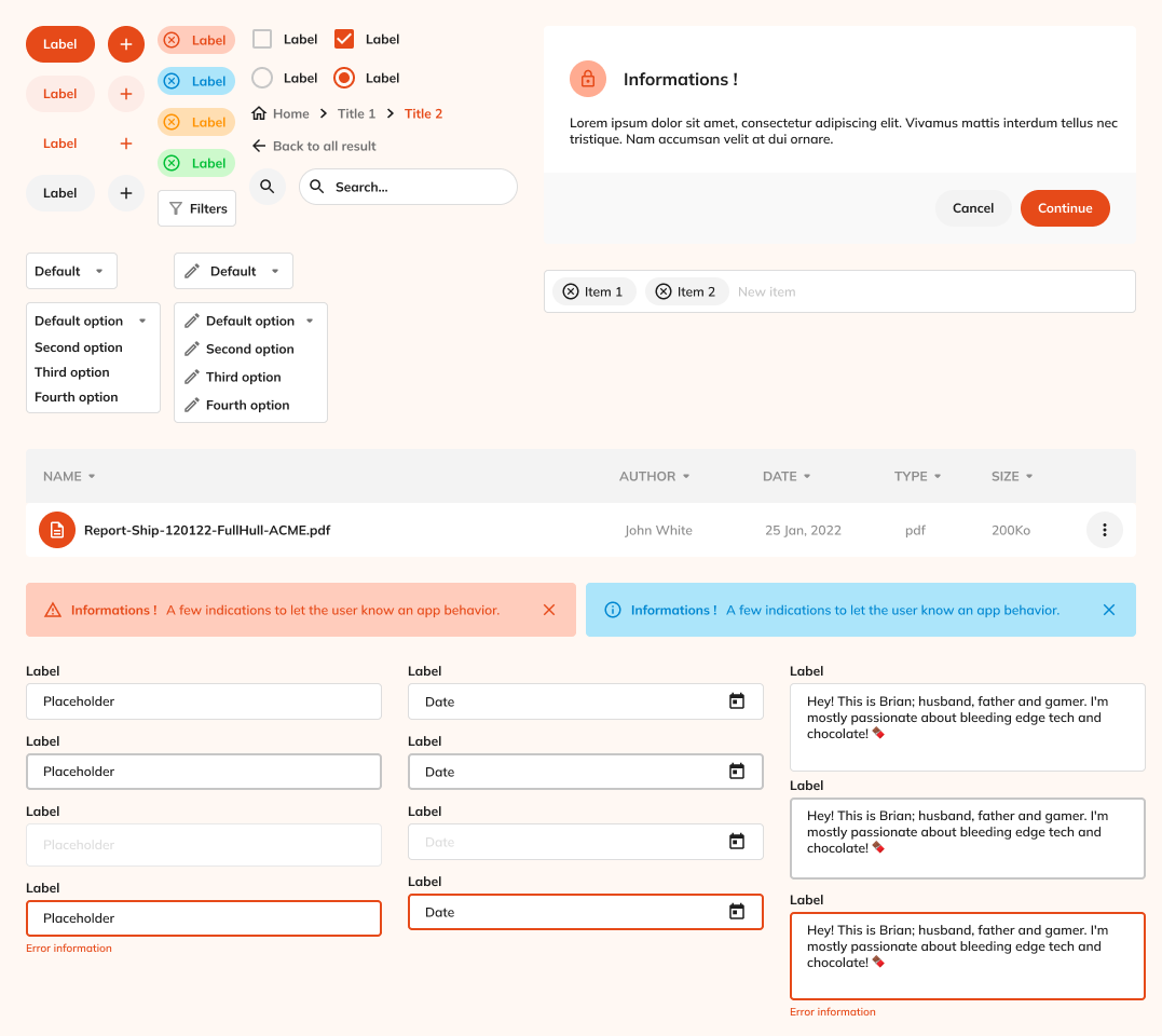
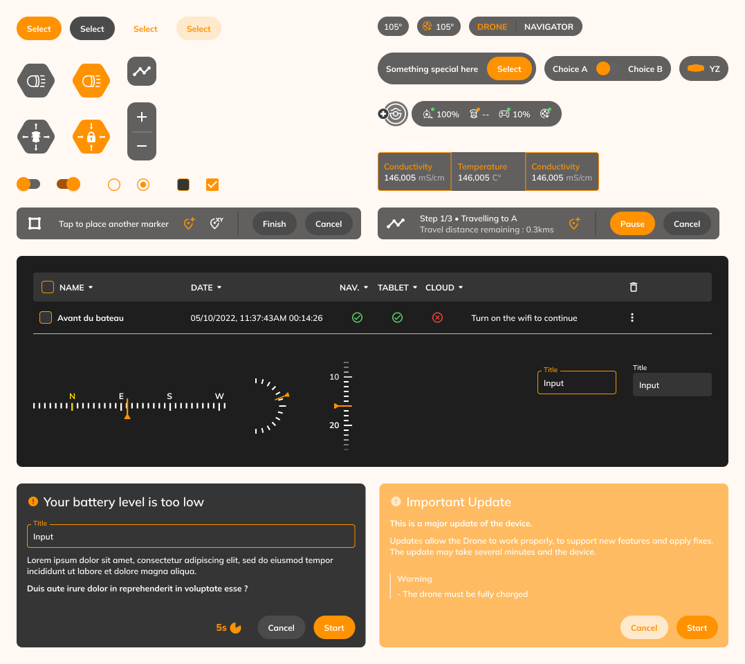
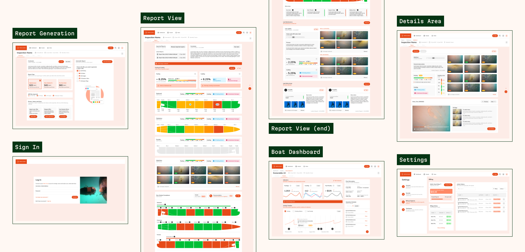
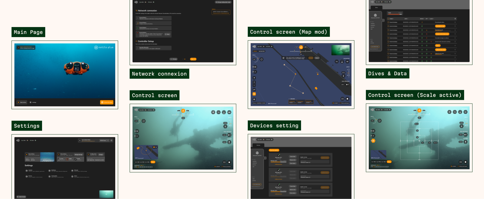
notilo plus cover

Notilo Plus

Underwater drone company

Role

As a product designer, my role was to design the whole user experience of features but also to mature a early design system.

Timeline

The duration of the mission was initially a few months as an alternate (December 2021 - August 2022) and then as a freelancer (September 1022 - December 2022).

Tools

Figma: Organization of UI kit and mock-ups.
Miro: Brainstorming and customer workshops.
Concept: Writing documentation.

Background

Notilo Plus digitalises the underwater world! The company designs and commercializes underwater drones, combined with algorithms data processing to monitor the state of the infrastructure or underwater ecosystems. Notilo Plus’s mission is to support sustainable blue economy. The company is thus active in many sectors of the marine and aquatic world, including scientific, commercial or defense navy, rescue at sea and whitewater, hydroelectricity, or recreational diving.

Problem

Aerial drones have almost become everyday objects. On the other hand, we know less about underwater drones, which are already widely used by the military. There are already several companies that sell this kind of drone, be it for military or recreational purposes, which makes the market competitive.

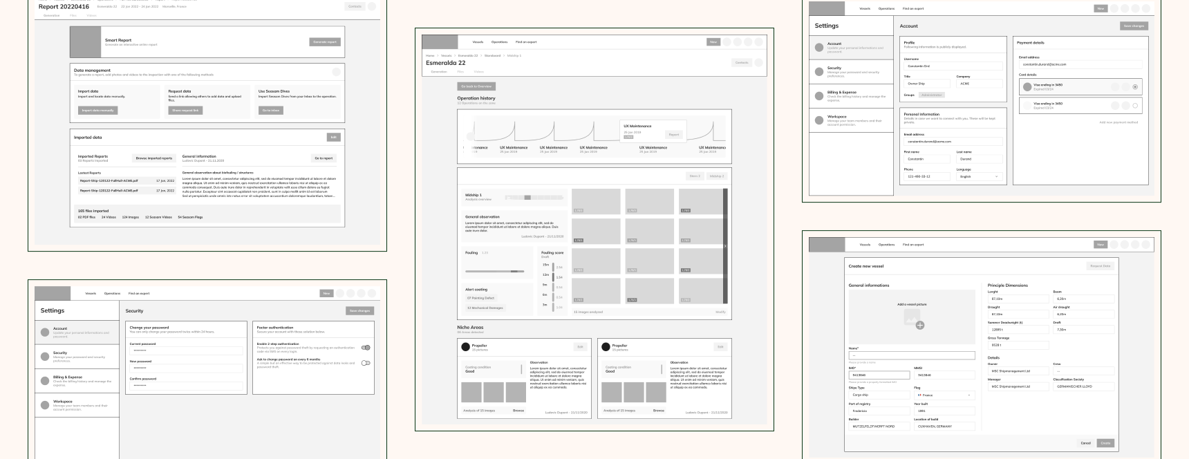
The use of a drone is already complex and accompanied by several features, it takes time to figure out how to take a hand 
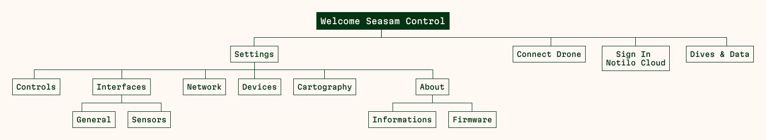
object. The interface is very technical, which is not necessarily suitable for clients, a lack of support can be fatal to maintain intent user’s.

Notilo Plus has an opportunity to stand out with the amount of services it can offer to attract clients as partners who can help them complement an already well-developed product.

Project Goals

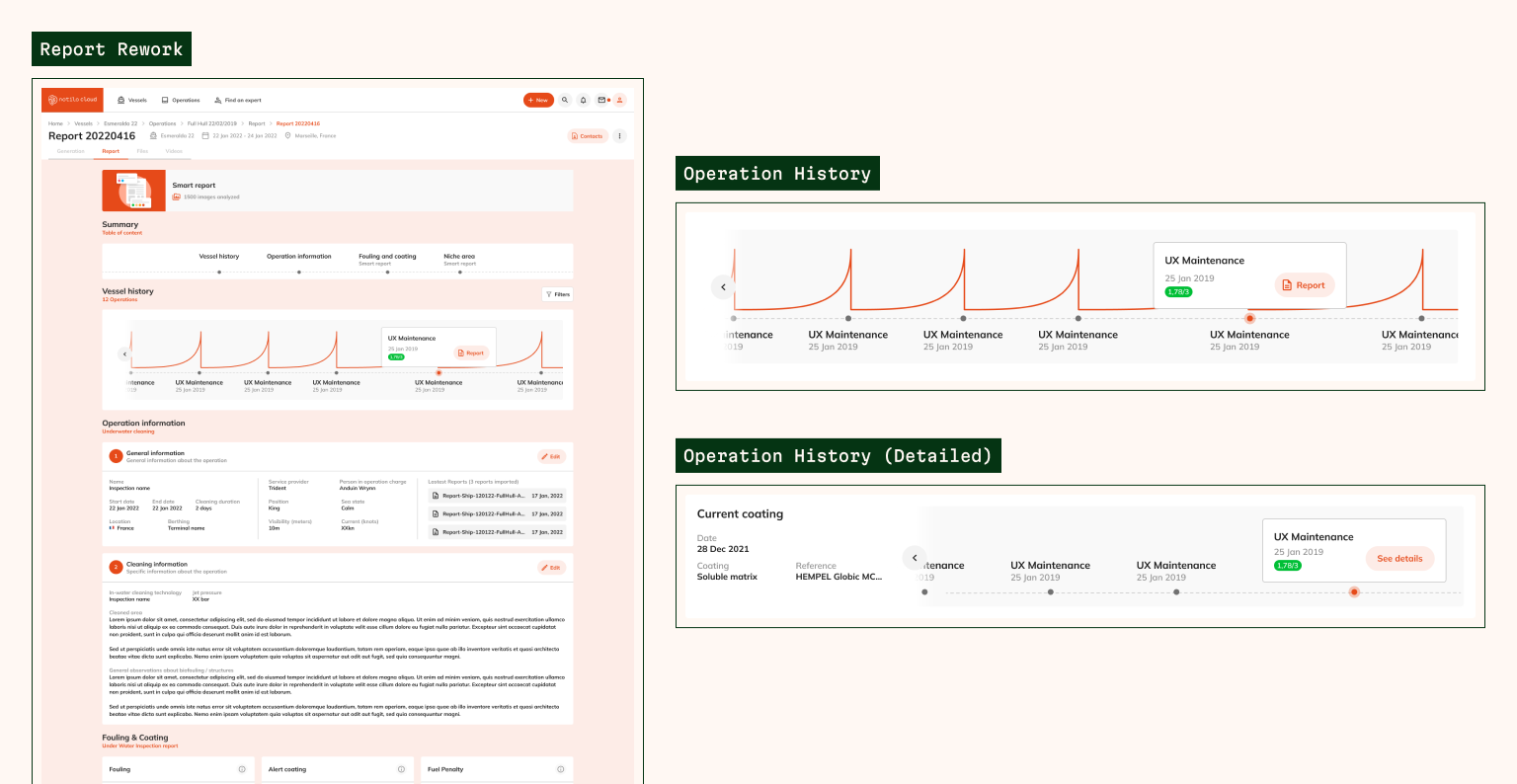
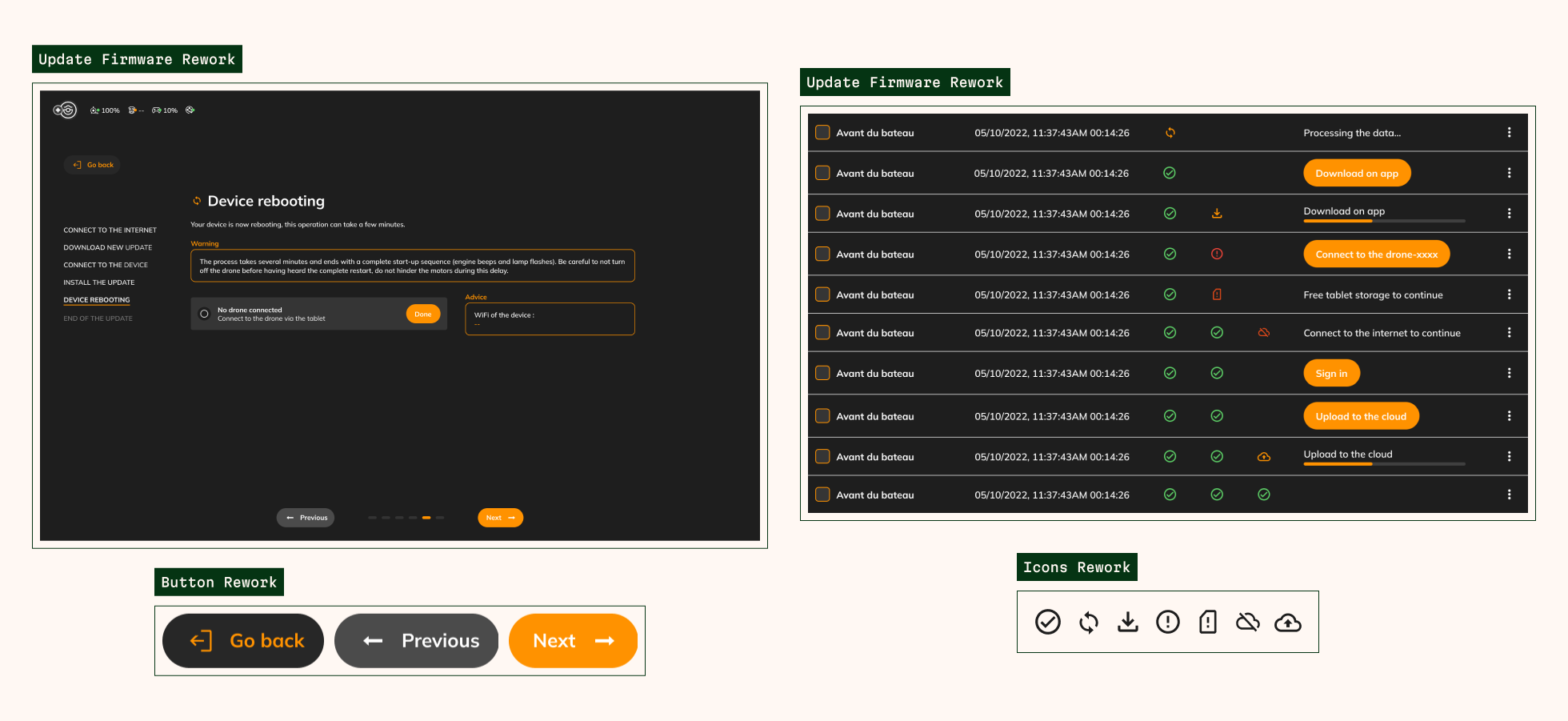
Notilo Plus’s mission is to improve access, clarity and visibility of underwater data. In this same idea, the company wants to offer a quality to its customers, including high-tech features and a experience. As a result, Notilo Plus also wants to make its expert image with strong identity and values.

Some information is not detailed or non-existent confidentiality of the tasks entrusted.

#1 Research & Empathize

Research approach Customer interviews Competitor analysis
Research approach

To understand what are the primary challenges and needs of our customers flying the drone, we approached the problem by interviewing our users on how they used the drone today and what are the proposals what the competitors were doing.

The purpose of my research was to:

  • Understand and identify the use pattern.
  • Know the steps where customers block or have trouble understanding.
  • If using other drones, what are the differences with ours.

Customer interviews

We asked 5 of our customers to use the product to know how which they take in hand, and what uses they make with it. Note that we took into account their experience on the product, what they started with, what were the difficulties and frustrations encountered.

We considered several challenges:

  • An interface with elements that are too small and therefore not liquid
  • Contrast that is not suitable for the sun
  • Complexity of Features
  • Not knowing where and how data is processed


But there are also positive points to the products:

  • Quick handling and ease of drone control
  • Quality after-sales monitoring
  • Several types of inspection are possible
  • Quality product (whether the drone itself or accessories)
  • Quick Report Generation

Competitor analysis

We compared the different competing drones. I noticed a big difference between price and quality of service, putting Notilo Plus in a weak position. Many of these drones specialize only in one area of inspection and have already the advantage of being in the market longer.

#2 Define

Persona development Problem statement
Persona development

According to our research, we have identified a common point for all our users. They are interested in the product itself but the lack of autonomy, of features that meet their need but also lack of affirmation if the product actually works for their boat and if it was the best solution for daily inspections. We also noted that users already experienced in inspections would be more likely to want results quickly. So we created several persona, but only two You will be introduced here: Jean Dupont and Tom Franck.

Jean Dupont is the proud owner of a transport ship since now 25 years. He is a man very busy with his deliveries that he cannot find time to properly inspect his ship. He sometimes forgets when was the last inspection, and when will be next, even if in the end he doesn’t necessarily know what to do to take care of your ship regularly. Not being a big fan technology, he would like to be able to entrust this task to someone he trusts who may give him advice.

Tom Franck, meanwhile, is an expert when it comes to inspection with a drone. During his career, he struggled to share his inspections and results to ship owners. He always tries to change his method inspection according to the ship but often gets blocked due to lack of

Problem statement

After all this research and analysis to see what the priorities are, we have identified several objectives and issues on which we will focus all throughout the project:

  • How can I simplify and accompany the user when choosing his inspection?
  • What is the best solution for standalone user?
  • How do I give accessibility to any type of user?


There are also other secondary issues that are not urgent, but that will be important throughout the project. Problems have arisen during several brainstorming sessions which are as follows:

  • How to simplify data sharing?
  • How to prioritize information during report generation?
  • Define a product identity through a more mature design system.
  • How do I make it easier to connect a ship owner with an expert?

#3 Ideate

Ideation Userflow Sitemap
Ideation
Random sketches & notes

Having treated the features one part, I was able to design different working method to form the first ideas, whether alone or with the rest of the team. Each of these methods started with a big brainstorming of at least one hour if not more.

Most of the time sketches were made in order to give a visual idea to what could look like the functionality or interface. There are many times when skits were non-existent, simply because the ideas did not come from within, which made me pushed to do this difficult exercise of researching more precisely not clear idea.

After sorting, I gathered up some of the sketches and notes that were done during brainstorming, by features:

Userflow

The userflows were carried out mainly for the functionalities of the application tablet. Several userflow have been realized, however here are the most consistent the application:

Firmeware Update from Seasam Control
Livestream from Seasam Control
Sitemap

The sitemap was, of course, created for the web platform from the start of the mission later, when the project will have matured. This is the first version of the tree made at the beginning of the mission, the last being confidential.

Another tree was created for the tablet application, a tree more detailed, since it was in the exercise of knowing where to find each parameter clearly and practically.

Sitemap Notilo Cloud
Sitemap Seasam Control

#4 Ideate

Wireframe Branding UI Kit
Wireframe
Random Wireframes

During the realization of these wireframes, I did research on various other applications driver but also other SaaS software to streamline the use of applications but also to be able to familiarize myself with software of the same type in order to offer an experience that are not completely unknown to them. However, it was also necessary to take into account the fact that the sites visited are not of the same domain and should be referred to our personas in order to have a correct platform and application.

In addition to existing features, I also wanted to include power save some parameters so that you don’t have to repeat the same loop path each time uses of the drone. From this list, the app will automatically detect accessories connected to the drone and offer a list of features that correspond to the accessory in question.

Branding

For the two different projects, there was already an identity specific to the two products, but not fully develop. While I was brainstorming on which project I was going to work first, I noticed the similarities but also the differences between the two identities. We have to remember that the two products come from the same and are both closely linked. After gathering all the elements graphics, I dug a little deeper into the similarities and what could graphically from one to the other. It took me a long time but it was better than creating new identities that people would take for two different products.

So with all this information in mind, I decided to create a common identity between the two applications, only the colors differ. I knew it was necessary to keep the colors corresponding to the maritime with vibrant colors and icons that would bring more gamification than text alone.

Notilo Cloud Branding
Seasam Control Branding
UI Kit

A UI kit already existed when I arrived in the company, however it had need to mature and corrected since the dimension, after verification was not good, this that distorted the real dimension that we had defined for developers. Moreover, there was a technology change in the meantime, we moved from Adobe XD to Figma in order to enjoy more broadly of the more advanced features of Figma at the time. So it was necessary to review the various elements and their classification when the software. Here is a part of the modified UI kit on Figma:

Notilo Cloud UI Kit
Seasam Control UI Kit
Final Design
Notilo cloud Design
Seasam Control Design

#5 Test & Final

Usability test Priority review
Usability test

Before launching these models in production at the developers, it was necessary to test them with our users. Not always available and not having the same pace of work that we, our clients were not always available, which is why an appointment regular Thursdays with our sales people (the closest to our customers) has been set up in order to debrief on high-fidelity models. In all the functionalities, they understood how to operate each screen and were able to go to the end of the process, but it should be noted that at some point certain action took longer, understanding some elements on the interface could be slow and sometimes they clicked in the wrong places.

  • Overall experience: One participant mentioned a poor contrast between the colors on the web application, not seeing certain elements. Two of them have mentioned more branding on the tablet app and more colors to brighten up the platform.
  • Dashboard (site): Several participants remarked that there was a lot too much information on the dashboard, not knowing where to look, not having the important information at first glance. One of the participants said not to appreciated the vague information we show without going into the concrete, he took much more time searching for the information he wanted
  • Report generation (site): Several participants mentioned not knowing to what was the interface when they had it in front of them. Participants did not know how to run the report generation, not being guided enough interface. Some thought that the elements were only design and not some interactive thing. One of the participants did not know where the report generation was.
  • First page of application (tablet): Two participants expected to have a introduction page to be able to connect or even have a tutorial to guide them, as this was the first time they opened the application (as part of the exercise). One of these participants also said that he did not want the tutorial at every connection.
  • Settings page (tablet): A participant scrollates from top to bottom of the menu to search to launch an introductory tutorial but didn’t notice it just down left. Another participant would have appreciated having the button more clearly. Two participants said they did not know what each party is and where to find their recorded data, the label being explicit. They also mentioned the fact of not clearly seeing everything there is written to cause of the lack of contrast but also of the sun tapping on their screen.
  • Pilot interface: Two participants said they wanted to have shortcuts to change inspection mode as they wish without going through the parameters, but also remove and add certain features as they see fit.

Priority review
Notilo Cloud Revisions

For the revisions, I reworked the interfaces and userflows in the application web but also that of the tablet taking into account the modifications to be made on the UI contrast kit. Participants were pleased to see the new web interface reworked, bringing more dynamism and colors. I also focused on the userflow, in particular the one for generating reports on the web application that is the essence of the application. For the home page, I decided make a global home page and a dashboard page corresponding to the fleet of the person, thus separating and orgnizing are the work plan.

For the reports page itself, I only made a slight change. I changed the way information is placed by integrating the new colors. In addition to this, participants mentioned that the report was lengthy to read and that they would like to have a synopsis so they can get to the point. After testing the different solutions for this story of contents, I realized that the header with the contents took up too much space on the menu. That’s why I reduced the size of the menu, leaving less space between all items.

Seasam Control Revisions

For the tablet application, participants appreciated the gamification in the choice of drone configurations, but when they have to go back to the previous step, they were confusing buttons to return to settings and button to return to previous step. So I decided to differentiate these two buttons more distinctly by putting the wording directly and especially by being careful not to put the same icon. After that, some step was not necessary if the drone had already been calibrated for a test or a first use in the day, the calibration steps could be passed by the user to avoid repeating the same checks.

As for the configuration screen, the screen to go up or even manage its data are done so that the user is aware of everything that is happening in permanance. With the back to home button, the user will be able to do something other than wait for all this data to be reported, a notification will be mandatory in order to warn them of the end of the operation. Thus, by clicking on the notification, they can Return to the data page and proceed.

Project Goals

This mission was done alternately and then freelance. This was my first real experience as a that Product Designer, and especially taught me the basics of Product Designer’s work.

Although this experience was not the longest, it was an experience filled with various and varied challenges.