working roll cover

Working Rolls

Serviced office company

Role

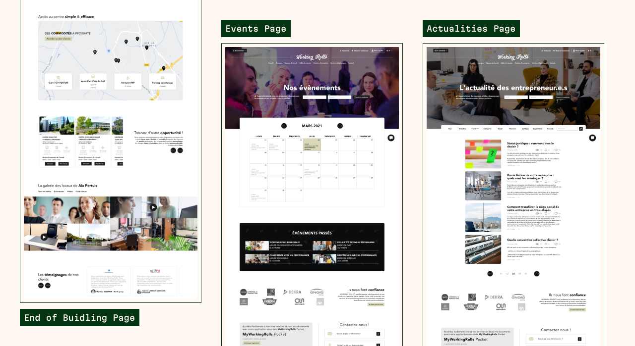
As UI designer, my role was to design the models pages of the site, as part of a redesign and review of the experience user.

Timeline

The duration of the mission was the time of a first year alternation (February 2021 - December 2021).

Tools

Adobe XD: Interface layout and set up a UI kit.
The prototyping of the models were also done on it.

Background

Working Rolls is an independent group of premium business centers and space coworking, member of the BURO Club network, offering innovative work solutions for business starters up to the multinational. Mainly located in the South of France for 14 years, Working Rolls makes it easy to its customers a turnkey workspace, combining services The European Union’s Structural Funds and Pooled Human Resources in the form of a pay-as-you-go package. Working Rolls offers in addition to corporate domiciliation, permanent telephone, rental of equipped meeting rooms and other solutions through its marketplace and its network of partners.

Problem

The pandemic, at that time, stopped the extravagant growth of offices in France. Reassessment of needs is just beginning and the most qualitative office premium After its worst year in ten years in 2020, the EU’s business real estate market rebounds in 2021. Investment demand is up 32%. It stood at 1.2 million m² in September and is expected to reach 1.750 million of m² at the end of the year.

We know a lot of direct competitors to date, which requires to stand out on several points: the services offered, the promotion of prices, the quality of the offices or geographic location.

Working Rolls knows a cruel lack of modernity in its brand image, which can it cost several customers who can look for modern rentals. In addition to this, the website, which is the center of any company communication, is not up to date on information she shares.

Project Goals

The mission here is to update the website, by facilitating the contact with commercial, while making it easier to access information. In the continuation, this will also allow the company to launch a new wave of communication new and new for her, which will allow her to expand her reputation.
Some information is not detailed or non-existent confidentiality of the tasks entrusted.

#1 Research & Empathize

Research approach Competitor analysis Customer interviews
Research approach

To get a better understanding of the current market and the potential clients we could attract, I used two research methods in me based on a competitor analysis and an interview on two different professionals. For the analysis of competitors, I am directly go analyze the competitors via their site to know and see if there was a common pattern, but also things not to reproduce that could repel the user.

To focus on active users, I interviewed two professionals work that had no office and had different statuses. They was both in the thirties, one freelance and the other in business, who had rented an office. These interviews lasted about 45 minutes. Before the interrogate, I obviously prepare questions to guide the course, although I took into account the fact that they both may have had different motivations and goals.

The purpose of my research was to:

  • Find and understand the different patterns of similar companies.
  • Identify user disadvantages and needs when taking on this type of service.

Competitor analysis

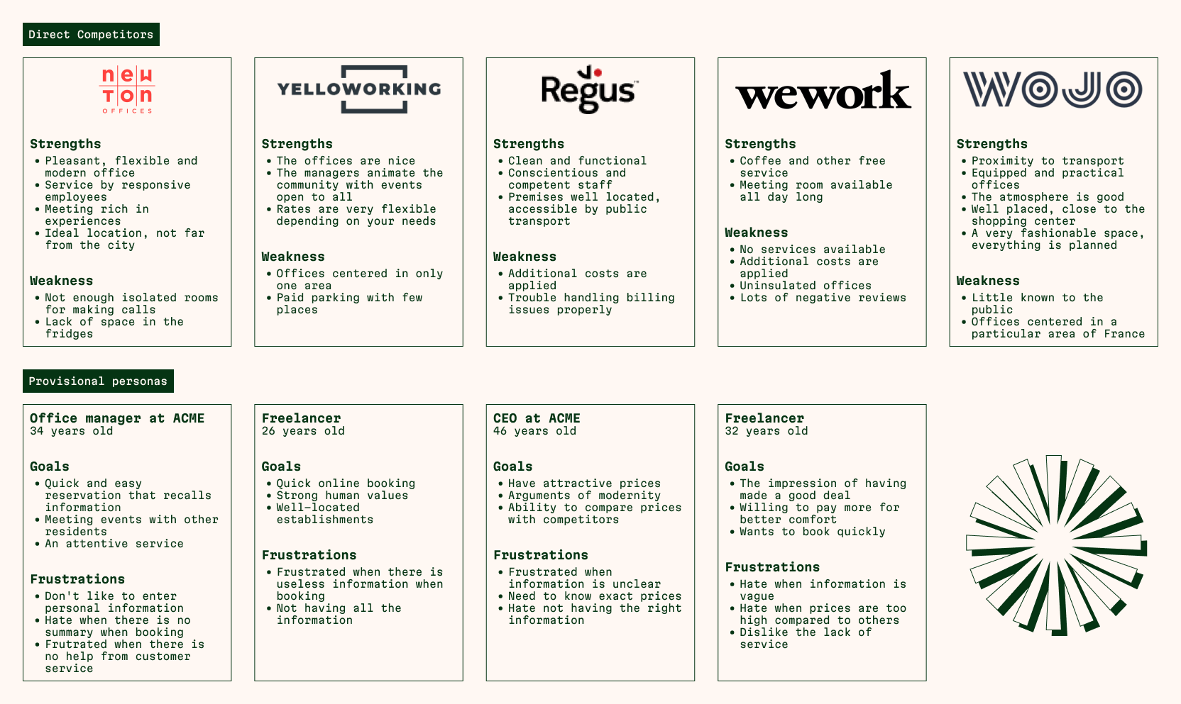
Knowing the practices used in the market was my priority when I did my research. My research was done with the information found on their websites but also reviews on Google and other platforms said to criticism. For the analysis of competitors, I have distributed the information roughly advantages and disadvantages, while taking into account the problems or solutions to long term.

I also created predictive personaes for each competitor to start on my own to create mine. So, I could write my questions for the interviews that would follow.

Customer interviews

As said before, I interviewed two professionals who had rented offices a few years ago now. Due to lack of time and resource, I could not continue more interviews, which I would have thought preferable for this project. The participants were in their thirties and were men, a freelancer and an office worker.

Here are some observations I can share with you:

  • All participants mentioned the importance of the price, but other factors influenced their booking. The price is one, if not the most important. The size of the offices, the quality of the network, the services offered, the geographical area, the proximity of certain other businesses and the travel time between their homes are very important to them.
  • One of the participants would be willing to pay more if the services offered as the domiciliation were of quality (ready mail on time, sorting advertisements, prompt notification). When it comes to outsourcing tasks that can be cumbersome, paying a little more doesn’t bother them.
  • The participants mentioned welcoming and inviting partners or customers to their office or meeting room would be a significant benefit, in that it would remain in a professional and modern environment with the materials they need.
  • One of the participants highlighted having space to work and privacy while on duty.
  • Both participants shared their desire to be able to book a quick service or meeting room without going through sales. Indeed, when they have busy days, they would like to be able to know and quickly book a room on the go so as not to waste time.
  • Participants made it a point to locate their workplace. Indeed, the closer the offices are to their homes and the easier they are to access, the more likely they are to choose certain institutions more than others.

#2 Define

Empathy map Persona development
Empathy map

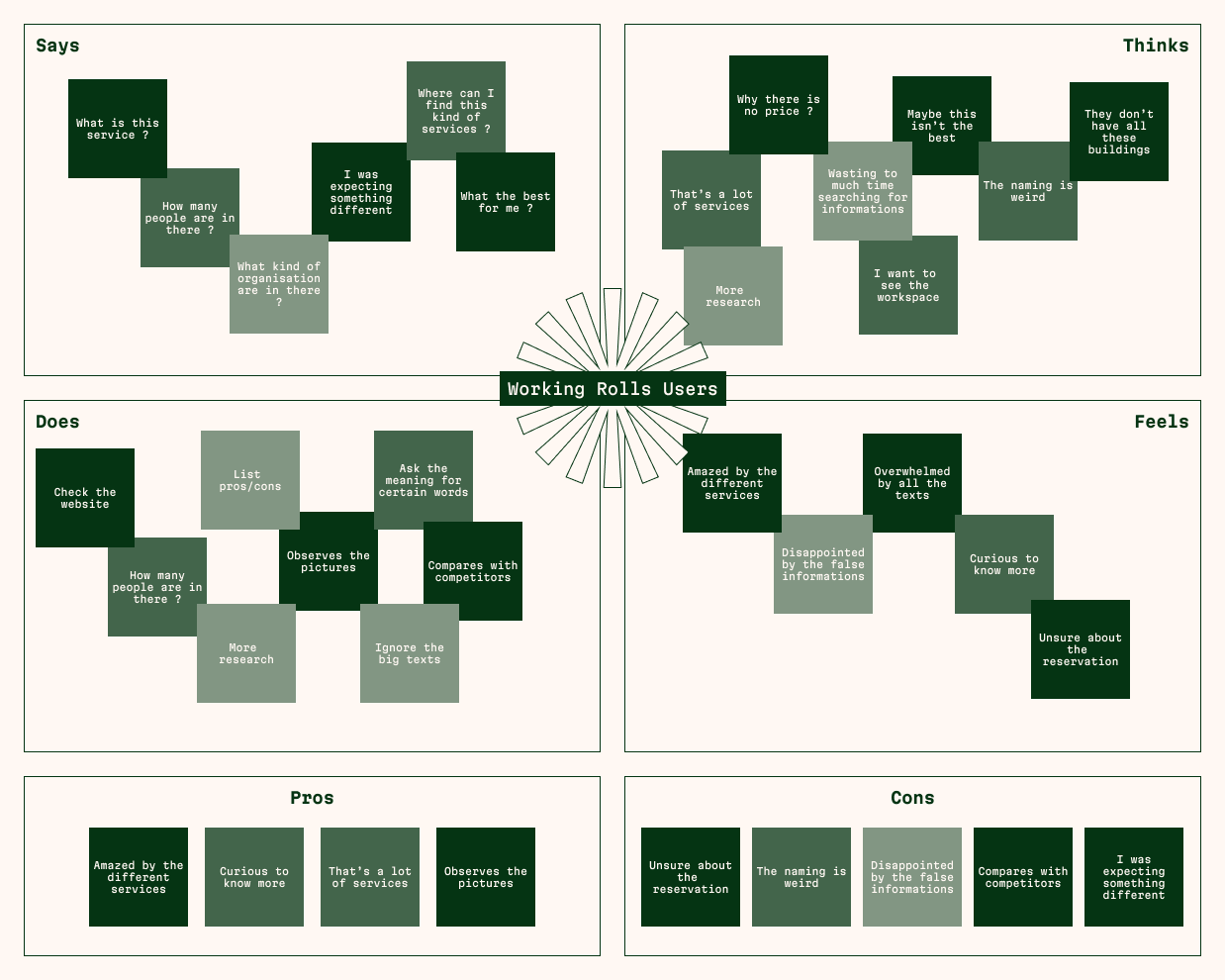
During the interviews, I found some points that he had to sort and prioritize. So at the end of the interviews, I synthesized what was said in an empathic table in order to understand and conclusion of these answers.

Study from the first week after I arrived
Personae development

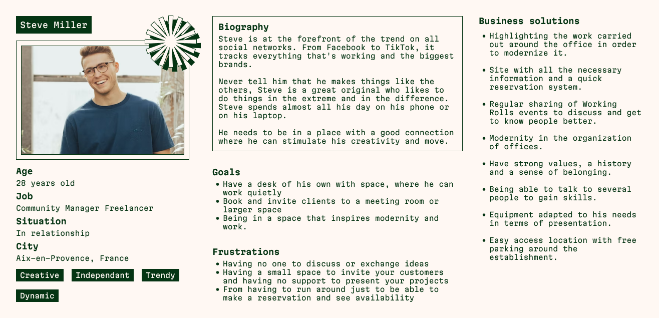
Steve is a freelancer who has just launched his Community Manager business. He lives in the city center in Aix-en-Provence, France. He has a lot of customers throughout France, especially in the south. He lives in a three-bedroom apartment room, but fails to work at home, not bearing to see the same furniture and landscape every time. It is also someone who likes to talk with new person, exchange new ideas and seek input from people around of him. Being new in the market, he does not necessarily have the background to buy offices. Sometimes, he has to welcome these new clients, meet them, and his home is not the most suitable for this.

#3 Ideate

Sitemap Userflow
Sitemap

After dissecting what was already existing on the current site, I decided to filter all “unnecessary” pages of our main objective, prioritize important pages and divide each page into a category so as not to get there lose. Obviously, all the pages listed and filed also served me to know which pages to model.

Once that was done, I realized how much information there was and it was almost impossible to put everything in one menu. So I had to do a second tree for the secondary menu that was going to be just above the main.

Main sitemap
Secondary sitemap
Userflow

Working Rolls has an online booking process they want to set up, simple and efficient, so as not to spend all the time through the commercial. With this in mind, I created a userflow that allows users to book a room or an office, offering a fast and complete experience. If none of the results corresponding to the user’s search, he will propose at this time to contact a salesman.

Reservation process

#4 Ideate

Sketches UI Kit
Sketches

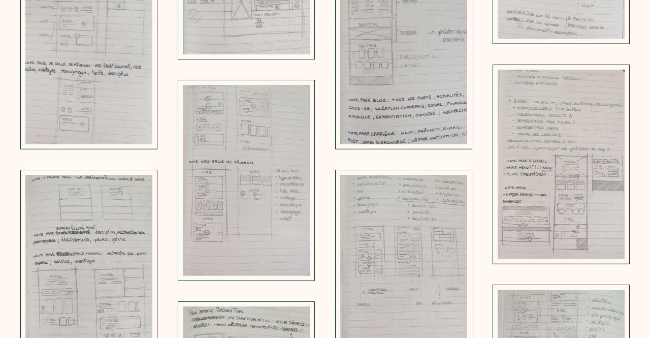
During my initial research, I noticed that more people would be inclined to reserve this kind of good via the computer, otherwise call the commercial for everything other type of service. I therefore prioritized the user experience have on a computer.

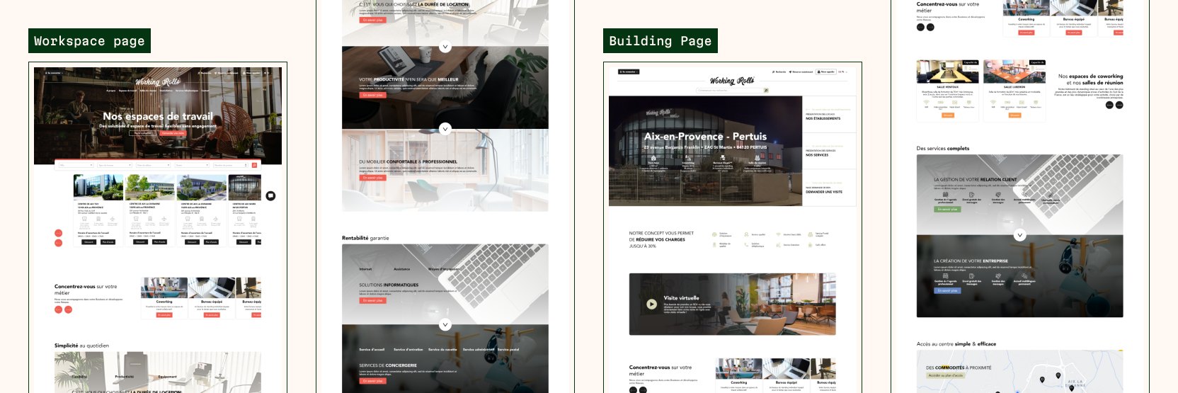
In my sketches, I was inspired by the design of the classic wireframes I saw during my studies. More particularly, the work had to be done quickly so there was no place to make a real wirframe or prototype to test I started with the homepage, which was to attract and give all the information necessary to the user without scaring them with the quantity information. I then drew the other pages with the same idea in mind. So thanks to my upstream work, I was able to know which pages to design quickly, and especially how.

Random sketches
UI Kit

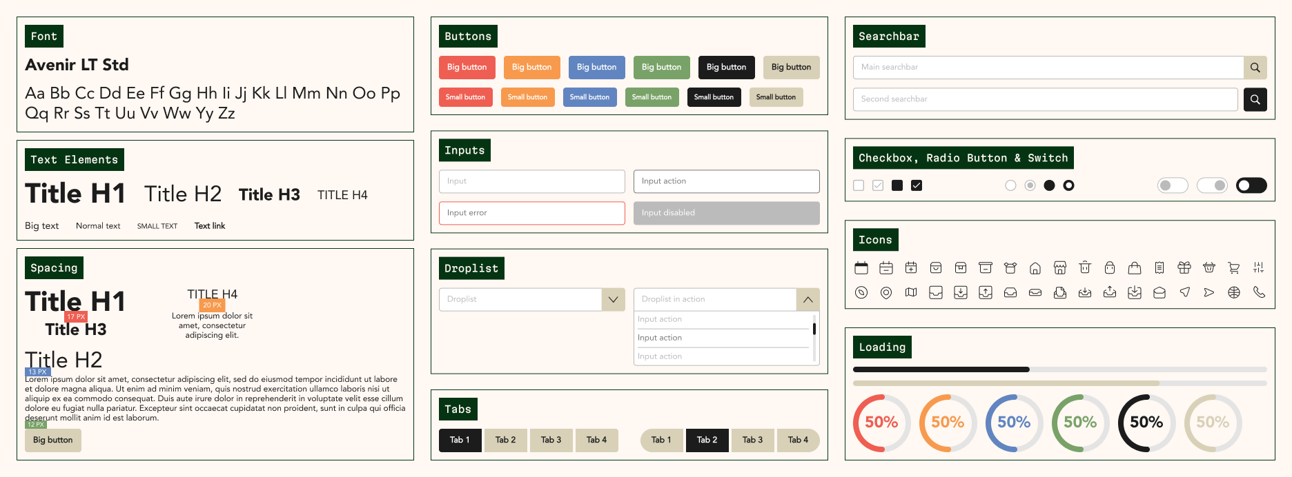
No UI kit existed when I arrived, off it was imperative to do so so that the pages are consistent and the site itself has its own identity. Identity, at that time, as I was being redesigned, I had to improvise with what he already existed so as not to get stuck on these points. So the main elements such as colours, font and certain elements have been taken over. As part of a modernization, it was also necessary to modernize these elements and to mature the most possible the UI kit in order to have a complete system design.

Start of UI Kit
Final Design

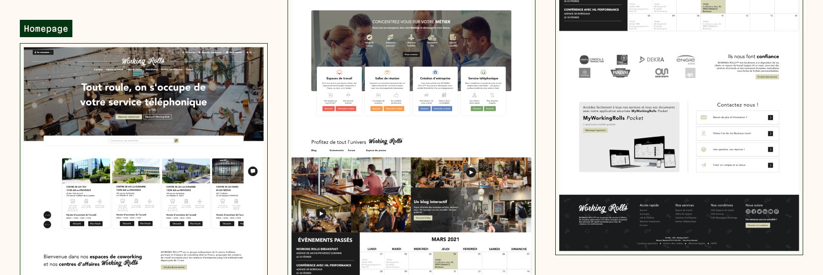
Although I focused on the computer site, I also worked on the mobile for the home page, being the first thing on which one arrives, it was necessary that it be visited on mobile in priority. After doing my research, I wanted to include these different elements on the homepage.

  • A modern facility - Like what I said in my research, Working Rolls needed to modernize, and for that, I worked some of the company’s branding that would adapt to the web, including flat colors but more modern than the gradients used before. Of course, I kept the color code used for each product so as not to distort the base product either.
  • Exclusive services - A lot of companies only put pictures of their premises, except I noticed that the services they offered were also important to highlight. Thus, it was necessary to put the services that could interest the user the most, such as domiciliation or telephone services (especially if users do not need premises in the first place).
  • Concerned staff - In addition to exclusive services, having personalized support, the user will feel unique and attentive when monitoring their activity. If the user feels comfortable, he or she will be better able to stay true to the same structure.
  • Loyalty that rewards - Here, the user will be aware that loyalty rewards with exclusive discounts and free participation in events organized by Working Rolls.

During the production of these models, users may want to compare the prices of the various solutions we can offer them or the price of the competition. Thus I have added a comparative table of prices with those of competition, comparing also the different services offered in relation to them.

Once their decision is made, the user can book with a simple forms the property that interests them. Of course, a call with a commercial will be planned in order to have an exchange and confirmation of the reservation to ensure that the customer is not mistaken. Indeed, Working Rolls still wants to keep human contact with users, preferring direct calls with customers.

Finally for the booking process, it happens as a questionnaire, to really know what the user wants is to offer him the best goods, without it being look too much. That’s why I also added a progress bar to that he can follow his progress and always be aware of where they are.

If they do not have any availability, they will be asked to call a salesperson or modify the previously selected information.

#5 Test & Final

Priority revisions
Priority revisions

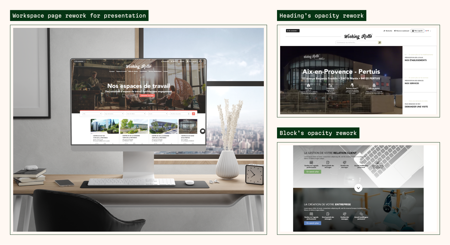
The biggest revision I was asked to do was the office page. Now that the user can select which type of desktop he could choose, it can also choose the additional services that it is responsible for. I also updated some elements to have a better contrast of the text when it was on an image. To avoid any confusion between products, it was necessary to specify at each header what the type of office was but also in what center one could turn this kind of good.

Project Goals

Unfortunately, although the project was interesting and extensive, no integration was done due to lack of developer. This was not my first experience as a UI designer, but it allowed me to develop my creativity and my autonomy. I’m happy to have been able to build a site at the base a little fragile that needed a renewal, even if this has not been built in behind.

If it were possible, I would have liked to continue my user searches for to know what the priorities would have been and not just to take them. I would have also liked to work more deeply the design system if I had had more freedom in the choice of my organization.

However, it remains an experience that I keep rather positively, which mostly made me learn from my mistakes, today I would certainly have worked differently and more methodical.